Official | HULFT IoT EdgeStreaming Adapter Reference First Edition: July 1, 2021
Designer screen
Start the Designer screen by double-clicking Designer in EdgeStreaming Studio.
Designer screen
This section explains the structure of the Designer screen of EdgeStreaming Studio.
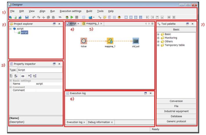
Figure 1.1 Designer Screen
1) Menu
The menu items to handle the basic actions of Designer and the toolbar for these menu items are ready.
2) Project explorer
The following actions are available:
-
Creating projects
-
Creating scripts
-
Executing scripts
3) Property inspector
You can change the settings of icons that you created on the script canvas.
4) Script canvas
You can create a flow by placing components or Mapper component icons on the script canvas and then connecting them by dragging and dropping one component icon onto another.
For details on component icons, refer to Types of component icons.
5) Mapping canvas
You can configure settings for the Mapper logics you created on the script canvas.
For details on the mapping canvas, refer to Mapper Reference.
6) Execution log
An execution log is output when you execute a script on EdgeStreaming Studio.
When an error occurs, the error code is output to the Execution log and the CLI screen.
For details about the descriptions and measures for error codes, refer to First Step Guide.
When you execute the script in debug mode, the values of the script variables within the script are output to Debug information.
7) Tool palette
The adapter components necessary to create a flow on the script canvas are registered to the palette.
For details on components, refer toTypes of components.
Right-click menu
This section explains the menu that appears when you right-click on a component icon.
|
Item Name |
Description |
|
|---|---|---|
|
Cut |
This item cuts the selected component icon. |
|
|
Copy |
This item copies the selected component icon. |
|
|
Delete |
This item deletes the selected component icon. |
|
|
Align |
Align left |
This item aligns the selected component icons to the left. When you align component icons to the left, the x-axes of all the component icons selected on the script canvas are moved to the position of the leftmost selected component icon. |
|
Align right |
This item aligns the selected component icons to the right. When you align component icons to the right, the x-axes of all the component icons selected on the script canvas are moved to the position of the rightmost selected component icon. |
|
|
Align top |
This item aligns the selected component icons to the top. When you align component icons to the top, the y-axes of all the component icons selected on the script canvas are moved to the position of the topmost selected component icon. |
|
|
Align bottom |
This item aligns the selected component icons to the bottom. When you align component icons to the bottom, the y-axes of all the component icons selected on the script canvas are moved to the position of the bottommost selected component icon. |
|
|
Align horizontally |
This item horizontally aligns the selected component icons at equal intervals. |
|
|
Align vertically |
This item vertically aligns the selected component icons at equal intervals. |
|
|
Global schema |
Register input schema |
This item registers the input schema of the selected component icon as a global schema. |
|
Register output schema |
This item registers the output schema of the selected component icon as a global schema. |
|
|
Properties |
This item opens the properties screen of the selected component icon. |
|
|
Set font color (*1) |
This item sets the font color for memos. |
|
|
Set background color (*1) |
This item sets the background color for memos. |
|
|
*1 |
: |
These items are displayed only when you right-click a memo. |
Official | HULFT IoT EdgeStreaming Adapter Reference First Edition: July 1, 2021